Self Checkout Shopping Cart
Instacart acquired Startup
Caper, a self-checkout startup later acquired by Instacart, brought me on as their first UI/UX designer. I prototyped, tested, and designed versions 0.5 to 1.0 of their product. During this time, I significantly improved the task completion rate. Additionally, I implemented a standardized workflow process for end-to-end design, ensuring consistency and efficiency across the development cycle.
Client
Caper
Services
UI & UX Design Prototyping Wireframing User Research
Industries
Retail
Date
UI/UX Designer

Overview
I was brought onboard as the first design hire for the self-checkout shopping cart project, which already had an MVP product in place. The initial scope of my work was to completely redesign their product, with a primary focus on optimizing the home screen layout to maximize advertising space while ensuring good usability. To kick off the project, I conducted an onsite heuristic evaluation. Additionally, I shadowed 5 testers during an onsite think-aloud test to gather valuable insights and feedback directly from users.
The average success rate for task completion was 52.7%.
5/5 testers could not add the first non barcode item without intervention
Removal process was confusing triggering weight scale issues in 4/5 testers.
5/5 users wanted more guidance on how to use the cart in the beginning rather than at task.
All Users with extra bags placed there personal belongings in the cart triggering a weight warning immediately. Leading to the first experience being an error state.
In addition to these findings the stakeholder wanted a redesign of the home screen to increase advertising space.

Version 1 : Max Ads & Minimized Cart
The first version was an epic fail. I was preoccupied with the request to maximize advertising space and created a minimized shopping cart drawn from my experience designing e-commerce websites. The result was a complete disaster, this version tested even worse than the MVP.
"oh wow I didn't even realize that's supposed to open. I just thought that was keeping track of how many items i had."
4/5 users did not realize the cart expanded at all without assistance. Only 1/5 users said it wasn't confusing however in there demography screening identified as a digital native and did most of their shopping online.
5/5 users experienced frustration trying to remove an item. Seeing that there was an add button on the cart they felt like the remove button should be located near the add button. Non of the users decided to click open the cart to locate the new button, thus triggering a weight scale warning by directly removing the product.
4/5 users experienced frustration trying to locate the checkout button. The nested checkout button in the cart expanded view was extremely confusing.
Learnings
💡Don't assume web based UX experience is similar to the experience of operating in a busy super market with multiple sources of visual and auditory distractions. The minimizing cart interaction design was often missed by the user because they are looking in the physical supermarket. Assume that the user is constantly distracted and have discontinuous attention.
💡Supermarket shoppers are all age ranges and digital experiences, don't assume e-commerce web based patterns are familiar, keep things are simple as possible.

Version 2: Split screen
1. A major stakeholder insisted on hiding the cart total and only displaying savings, which led to frustration among users in previous testing. In this version, I chunked information such as subtotal, savings, and the checkout button to provide clear visual access. This approach increased user trust in the product.
2. The remove item function was made more visible compared to the initial version. However, during testing, most users attempted to remove items directly from the cart. One user tried to delete an item by swiping on the card item, similar to an iOS gesture, before locating the remove item button elsewhere on the screen and initiating the two-step process.
3. Despite providing clear instructions, most users did not read the copy; instead, they attempted to add barcode items by pressing the big FAB (Floating Action Button) first. This behavior indicates a need for further interface refinement to improve user comprehension and interaction clarity.
Learnings
✅ Split screen with no nested actions dramatically increases usability.
💡 Users don't like reading labels, how can I rely more on visual design to convey meaning?

Version 3: Right Hand Optimization & Simpler Design
1. The card-like structures for promotions, rather than traditional flyers, provide us with greater scalability for creating location-based promotional items. Furthermore, they allow for more customization based on each shopper's personal habits.
2. I completely eliminated the two-step process of deleting items by placing a trash button next to each item. Initially, I was concerned that this approach might clutter the interface and detract from the user experience. However, through testing, it became evident that over-prioritizing a clean UI can sometimes lead to a poor user experience. Users responded positively to the direct access to delete items, finding it intuitive and efficient.
3. Adding text inside the "Add item without barcode" button reduced attempts to add barcode items this way. However, I observed that users frequently struggled to identify non-barcode items such as fruits. This remains an area for improvement in user understanding and interface clarity.

Final: Home Screen
Loyalty login is a top priority because capturing data on returning users and building their shopping profiles is crucial for our long-term business model. In future iterations, integrating loyalty login will influence the promotions displayed on the left-hand side of the interface, so it's strategically placed outside of your cart actions.
Help resources are consolidated on the right-hand side of the "My Cart" page, keeping user interactions as streamlined as possible.
The "Add item without barcode" button is designed with an apple icon integrated into it. In testing with 3 out of 3 users, they successfully recognized that this button was specifically for adding produce items and did not attempt to use it for scanning barcoded items. This design effectively communicates the intended functionality to users.
Adding an Onboarding Process: Educate Preemptively
I created an onboarding process that addresses two key pain points identified in the heuristic evaluation. One major issue was users placing personal items like bags in the shopping cart, triggering immediate error states. To mitigate this, in the onboarding process, I prompt users to place their personal items first, allowing the scale to zero out to accommodate these belongings.
Next, I guide users through tutorials on scanning both barcoded and non-barcoded items. Additionally, on the home page's default empty state, I prominently feature these tutorials.
Initially, I included a flow for removing items and emphasized the location of help and checkout options. However, I discovered that simply instructing users on how to remove items didn't effectively change their behavior of physically removing items from the cart, which still triggered error states. Instead of focusing solely on changing this habit, I shifted my approach to designing a seamless experience after users physically remove items from the cart. This adjustment aims to enhance the overall user experience rather than solely relying on modifying user behavior during item removal.

As the first design hire in a fast-paced startup, integrating design and UX within the product development cycle is half the challenge. I've helped introduce standardized processes for communication and development, encompassing user flows, a component library, design system, and streamlined handoff procedures. This holistic approach ensures cohesive and efficient product development aligned with user-centered principles.

With my PM, I conducted a series of user flow workshops involving developers and stakeholders to map out comprehensive user behaviors. This approach was essential as it uncovered both front-stage and backstage actions crucial for understanding beyond what the MVP alone could reveal. Additionally, it addressed numerous corner cases that were challenging to replicate in initial designs.

This early user flow example highlighted a shift from traditional user flows, which struggled to capture the software's complexity. Drawing inspiration from a service blueprint, we categorized actions into front-stage and backstage, enabling us to capture detailed processes while defining clear visibility boundaries.

Once we began building out the screens, the user flows evolved into a screen-based approach. Finger emojis were used to mark user actions, a scale symbol denoted the weight sensor, and annotations for front-end and back-end effects were included beneath each screen.

Furthermore, corresponding LED lights and sounds are clearly marked with their corresponding screens, including animations and timed transitions where applicable. This user flow system significantly accelerated development and established a single source of truth for the entire team to reference. Previously, knowledge was scattered, whether in the memories of developers and stakeholders or in Google Docs.

Component Library
To further standardize our workflow processes, I initiated a component library as the single source of truth for our design team's scalability. Above is a view of global components for our core product.

Design System
I also developed a design system to standardize our visual style and implemented clear documentation. This resulted in improved efficiency, design consistency, and faster handoff to development. Moreover, the implementation optimized workflows and established a scalable foundation for future updates.
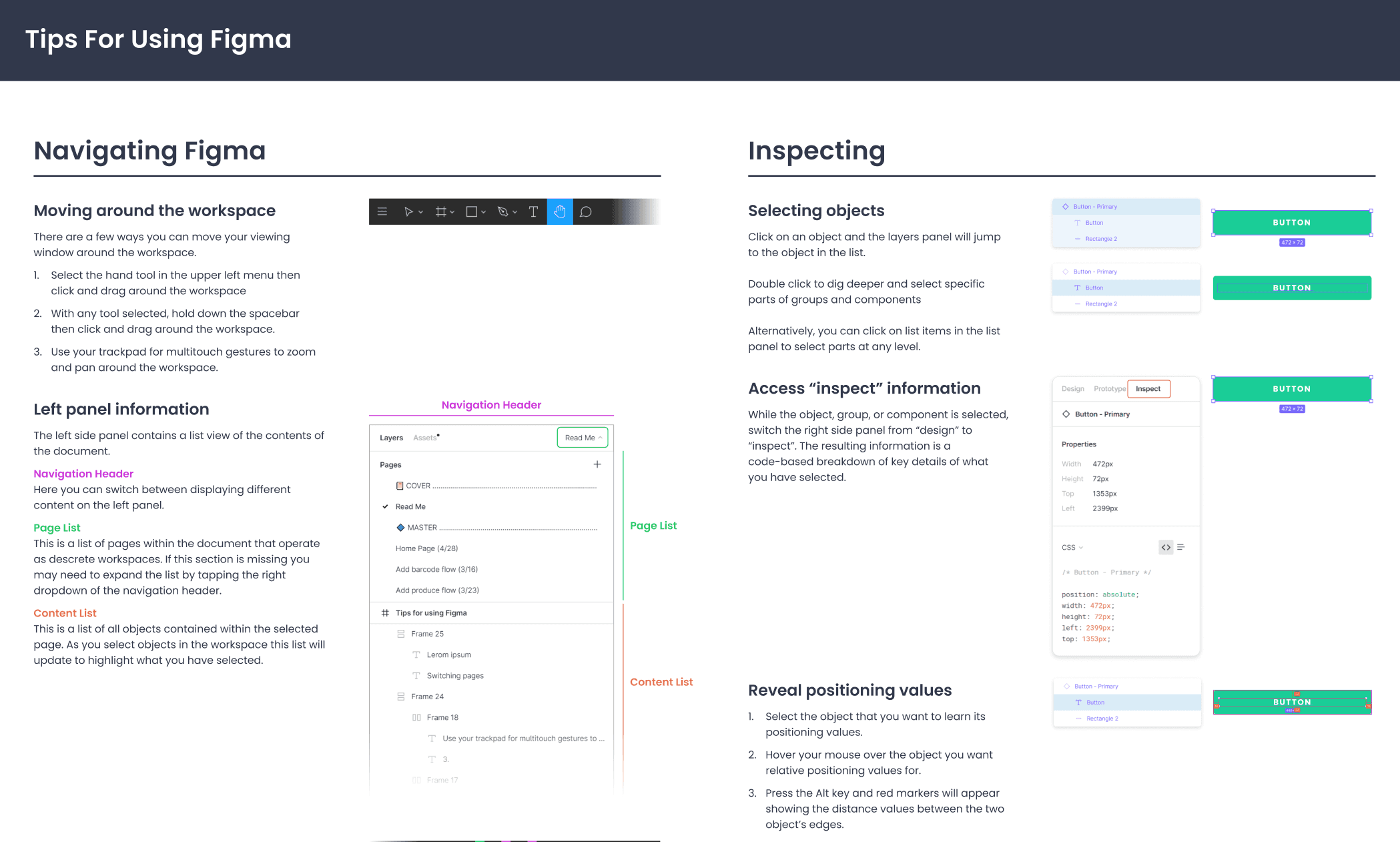
During the handoff implementation, we observed that instructing developers to watch Figma tutorials was ineffective. Instead, creating a concise guide focused on essential information led to a significant reduction in technical Figma-related questions, such as 'how do I export x asset' and others.
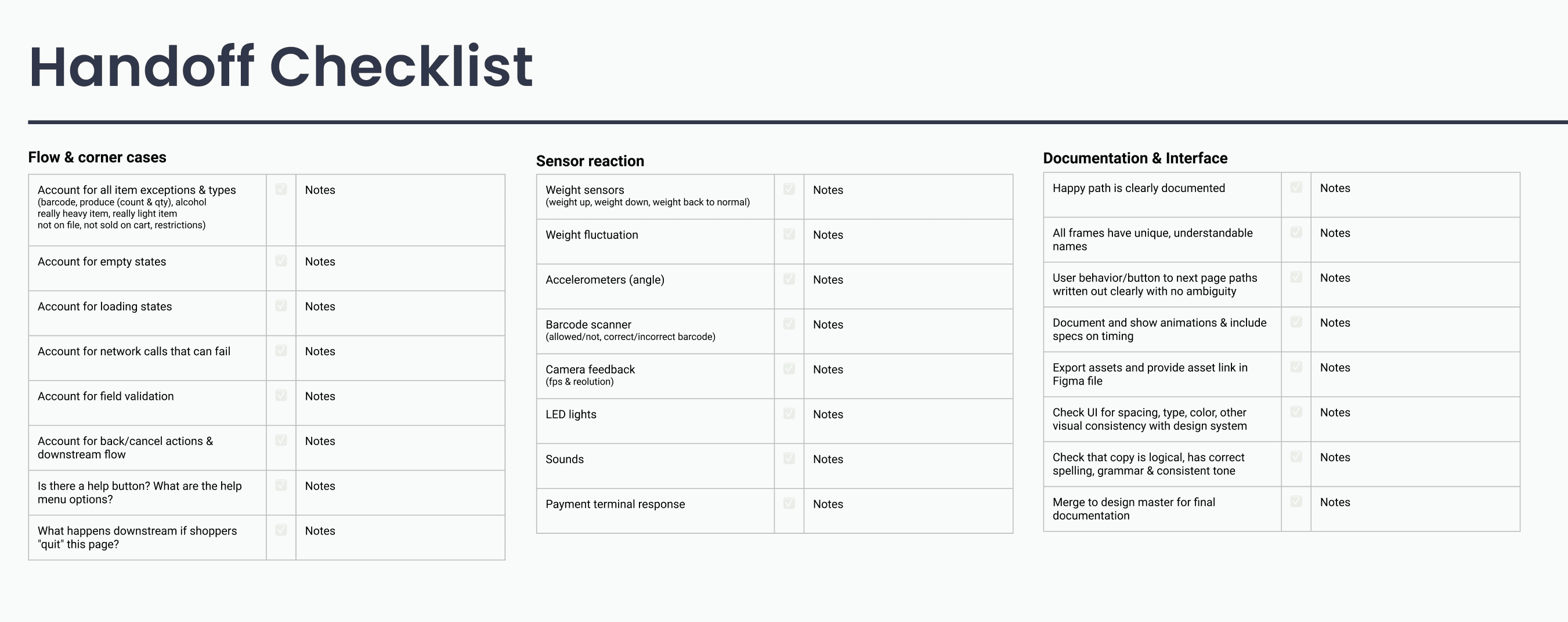
Furthermore, working closely with developers and the PM, we consolidated a checklist to ensure a thorough handoff system for the designers to adhere to. Given the complexity of the product, it's easy to overlook certain aspects. These checklists have greatly improved my ability to deliver comprehensive handoffs and maintain quality assurance.
Impact and Learning
Achievements:
Increased task completion rate from 52.7% to 91.8%.
Reduced errors from personal items by 66% with onboarding.
Improved user ability to handle barcode and non-barcode items.
Established design process within product launch cycle
Streamlined design workflow and developer handoff.
Areas to Improve:
Address weight scale errors due to movement and user behavior.
Ensure user awareness of the scale's presence and function.
Scale the design system to incorporate other product offerings.
Future Focus:
Develop user-friendly troubleshooting methods.
Enhance onboarding to educate users about scale usage.
Continuous improvement of workflow through close collaboration with developers and PM.